Tablet
Phone


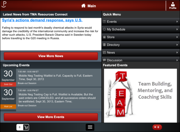
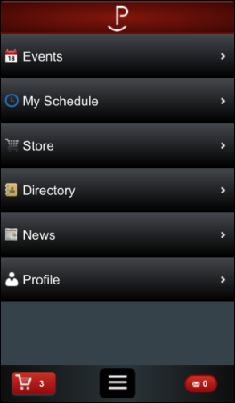
When your users first open the mobile application, they are presented with a Main screen that can offer the following options for each available module:
· Header
· Footer
An image of the default Main screen is displayed below. The modules that display for users are configured in App47. For more information, please see Configuring the Home Module.
Tablet |
Phone |
|---|---|
|
|
A header will appear as you proceed through the application, as displayed below.
Tablet |
Phone |
|---|---|
|
|
The header can display the following options described below.
· Logo

You can add a logo to display on the left of the header on the tablet application,
and on the Main screen of the phone. When a user selects this option on
the tablet, they will be redirected to the main screen. The logo is configured
in App47, for more information please see Configuring
the Info Module.
· Profile
![]()
The Profile icon appears in the header on every screen from the tablet
application. When selected, the user (if logged in) will be directed to
his/her personal profile page with options to view contact and purchase
information, or visit his/her online profile in e-Business. To view the
profile from a phone, users can select the menu option located in the
footer. For more information see the Profile screen.

The Main screen on the tablet displays a Latest News Update section. This section is configurable to display the most recent article from the News screen with a button directing users to the News menu option. For more information, please refer to the News screen.

The Quick Menu is displayed on the right of the Main screen for the tablet. On the phone, the quick menu is the Main screen. The options that display on the quick menu are defined in App47. For more information, please see Configuring the Home Module.
 The
icons displayed with each menu option are configurable. You can change
the icons by updating resouces\app47\icons\phone\*.png in the resources.zip
file. All icons should be 35x35 and in the .png format.
Mobile users can use the Quick Menu to navigate through the options in the mobile application. The follow options appear as a default:
· Events
When selected, the user is directed to the Events
screen to view a list of all web/mobile-enabled events.
· My Schedule
When selected, the user is directed to the My
Schedule screen to view all sessions and events he/she has added.
· Store
When selected, the user is directed to the Store screen.
From there, users can search for and select mobile/web-enabled inventory
products to purchase.
· Directory
When selected, the user is directed to the Directory screen. From there,
users can search for and view members and companies who have selected
to include their information in the mobile/web directory. They are also
provided the option to add a contact to their personal address book.
 Staff users
will see all records, regardless of the Include in
Web/Mobile Directory flag.
· News
When selected, the user is directed to the News screen.
From there, users have the option to view RSS entries that have been updated
in real time.
· Discussion
The Discussion module is enabled only if you have integration with Higher
Logic. When selected, the Discussions option
opens a browser directing you to the higher logic website. You can find
the configuration settings for the Discussions
module in App47.
· About
This option displays in the quick menu only on the tablet (although you
can access this screen on your phone by clicking the footer menu and selecting
Info). When selected, the mobile user is directed to a screen providing
them with any contact information you have entered about your organization.
For more information see the About screen.

This section displays the three events closest to the current date on the Main screen of the tablet and is configurable to link to current and future mobile/web-enabled meeting product. Users can select the View More Events button to view all web-enabled events. For more information, please see the Events screen.

The Featured Events section is configurable in App47 to display a number of rotating images on the tablet. Mobile users can tap the image to be directed to the Event Detail screen for the featured event. For more information on defining featured events, please see Configuring the Events Module.
 The
recommended size for the featured events image is 330 x 590 for the phone
and 539 x 296 for the tablet.
A footer will appear at the bottom of each page on the tablet and the phone as users navigate through menu options, as displayed below.

The following features are available from the footer:
· Shopping Cart
The shopping cart icon appears in the footer as displayed below.
![]()
When selected, the mobile user will be directed to an e-Business web page
displaying all the items in the cart. The mobile user will be able to
purchase, add, or remove items from the cart. For more information, please
see the Store screen.
· Menu Options
The Menu Option icon appears in the footer of the tablet as displayed below.

When selected, it will display the various menu options, as well as a button
to link users back to the main menu, or to view information about your
company.
![]()
 The icons
displayed above are configurable. You can change the icons by updating
resouces\app47\images\main\*.png in the resources.zip file. All icons
should be 35x35 and in the .png format.
· Notifications
The Notification icon appears in the footer as displayed below.

The number in this icon represents the number or unread notifications.
When selected, it will display read and unread notifications that a user
has not deleted. For more information, please see the Notifications
screen.