The Page Management screen displays.
In order for the responsive .NET controls to behave as planned, they need to be placed in the correct layout. Some web controls can only work as intended when placed in either a two column skin, a three column skin, or a full skin. Please see Responsive Skins for a list of the skin layouts (e.g., one column, two column, etc.) and what controls should be dropped on the page in order for it to be responsive.
To configure the responsive CSS if you are using the CMS DNN:
1. Delete the Mediaqueries folder and its contents from the website.
2. This applies for DNN only. An administrator MUST delete the metatags from the DNN header setting area of the Shopping Cart, Checkout, and Thank You pages. This step is MORE important than deleting the folder, because if you do not delete the metatags, the page will be referencing a file from a folder that no longer exists. This may result in a browser throwing an error on the page.
3. Log into your site as an administrator.
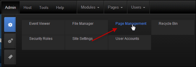
4. From the Admin drop-down,
select Page Management, as highlighted
below.
The Page Management screen displays.
5. Navigate to the desired page,
right-click on it, and select View Page, as
highlighted below.
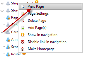
The page displays.
6. From the tool bar,
select Edit Page > Page Settings, as highlighted
below.
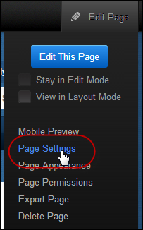
The Page Details screen displays.
7. Select the Advanced Settings tab.
a. From the Page Skin drop-down, select the appropriate skin.
 In order
for the page to be responsive when users are viewing it on a mobile device,
the appropriate skin should be applied to it. Please see the Responsive
Skins topic that lists what skin and controls should be dropped on
the page in order for it to be responsive.
In order
for the page to be responsive when users are viewing it on a mobile device,
the appropriate skin should be applied to it. Please see the Responsive
Skins topic that lists what skin and controls should be dropped on
the page in order for it to be responsive.
b. In the
Appearance section, enter the following two meta links in the Page
Header Tags field, as highlighted below:
<meta name="viewport" content="initial-scale=1.0"
/>
 This
meta link is what scales the page to fit the width of the phone or tablet.
If you do NOT add this meta link, it will display the desktop version
of the site on the mobile devices. If you create a new page and want it
to be responsive, you MUST add this meta link to the page and apply the
responsive skin.
This
meta link is what scales the page to fit the width of the phone or tablet.
If you do NOT add this meta link, it will display the desktop version
of the site on the mobile devices. If you create a new page and want it
to be responsive, you MUST add this meta link to the page and apply the
responsive skin.
c. Click Update Page.
8. The HTML
markup tags that you will add to your responsive page will be determined
based on whether or not you are using the Personify’s APA skin package.
If you are using the Personify’s APA skin package, the bottom navigation,
as shown below, is included and you only need to update the URLs for your
Login and Online Store Landing
pages.
If you are NOT using the APA skin package or you want to create new skin
pages, you need to add specific HTML markup tags to your page in order
for the bottom navigation to display. To add specific HTML markup tags
to your page if you are NOT using the APA skin package or you want to
create new skin pages:
a. Open the respective file.
b. Add the
following code BEFORE the footer line:
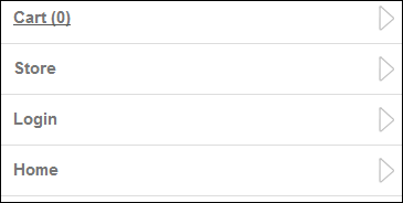
<div class="bottom-navigation mobile-way desktop-hide">
<ul>
<a
href="#" class="shopping-cart-url"><li>Cart
(0)</li></a>
<a
href="#" (UPDATE THIS URL WITH
YOUR STORE PAGE'S URL)"><li>Store</li></a>
<a
href=" (UPDATE THIS URL WITH
YOUR LOGIN PAGE'S URL)" class="login-url"><li>Login</li></a>
<a
href="<%="http://" & PortalSettings.PortalAlias.HTTPAlias%>/default.aspx"><li>Home</li></a>
</ul>
</div>
Make sure
to replace the bold and highlighted text above with your login page's
URL. Since the Search control redirects users to your Store page's URL,
this link does not have to be added to the markup.
c. Click Save.
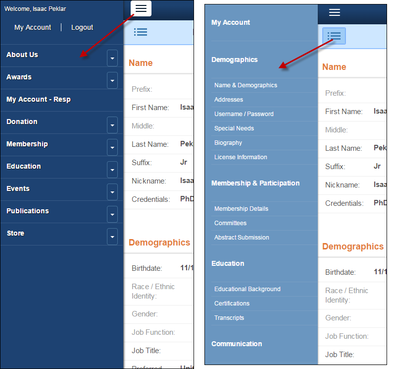
The hamburgers, as highlighted below,
are part of the responsive skin layout page that is applied to the page.
The login is built in to compact the menus when the width is less than
the media query break point. The bottom left hamburger is specially built
to grab the links that are in the left
column of the desktop version of the site and place them in that light
blue panel that slides out for the sub menu/left navigation bar when viewing
it on the mobile version of the site.
See Also:
· Making a Page Responsive Overview
· Making a Page Responsive Using a CMS other than DNN