 The responsive skin should be applied
to every page that allows users to login to you website (e.g., Login,
Guest Login, and Guest Email Lookup).
The responsive skin should be applied
to every page that allows users to login to you website (e.g., Login,
Guest Login, and Guest Email Lookup). As of 7.5.1FP1, the Login Request Control can be configured to be responsive to mobile users. Depending on which Content Management System (CMS) you are using will determine how you are going to configure the page in order to make it responsive. The following sections explain how to make your page responsive depending on which CMS you are using:
· DNN
The responsive skin should be applied
to every page that allows users to login to you website (e.g., Login,
Guest Login, and Guest Email Lookup).
As of 7.5.1 FP1, in order for the page to be responsive when users are viewing it on a mobile device, the Host:PersonifySkin-index-responsive skin should be applied to it. This is a one column skin.
To configure responsive CSS for the Login page:
1. Log into your site as an administrator.
2. From the Admin menu,
select Page Management, as highlighted
below.
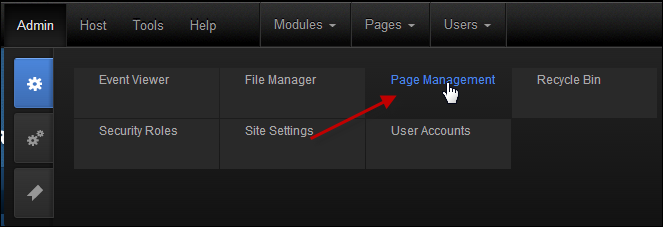
The Page Management screen displays.
3. Navigate to the
Login page, right-click on it, and select
View Page, as highlighted below.
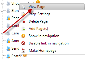
The Login page displays.
4. From the toolbar, select
Edit Page > Page Settings, as highlighted
below.
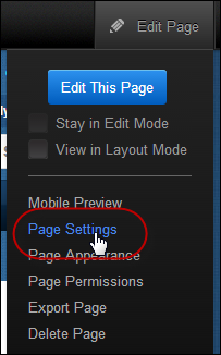
The Page Details screen displays.
5. Select the Advanced Settings tab.
a. From the Page Skin drop-down, select "Host:PersonifySkin-index-responsive".
b. In the
Appearance section, enter the following meta link in the Page
Header Tags field:
<meta name= "viewport" content="initial-scale=1">
 This meta
link is what scales the page to fit the width of the phone or tablet.
If you do NOT add this meta link, it will display the desktop version
of the site on the mobile devices. If you create a new page and want it
to be responsive, you MUST add this meta link to the page and apply the
responsive skin.
This meta
link is what scales the page to fit the width of the phone or tablet.
If you do NOT add this meta link, it will display the desktop version
of the site on the mobile devices. If you create a new page and want it
to be responsive, you MUST add this meta link to the page and apply the
responsive skin.
c. Click Update Page.
6. Finally, navigate to the Personify Skin directory folder and open the index-responsive.ascx file.
a. In the
index-responsive.ascx file, add the following
code BEFORE the footer line:
<!- CODE STARTS HERE -->
<div class="bottom-navigation mobile-way desktop-hide">
<ul>
<a
href="#" class="shopping-cart-url"><li>Cart
(0)</li></a>
<a
href=" (URL-PLACEHOLDER)"
class="login-url"><li>Login</li></a>
<a
href="http://Default.aspx?TabId=71&returnurl=%2fPersonify751%2fDNN%2fdefault.aspx"
class="login-url"><li>Login</li></a>
<a
href="<%="http://" & PortalSettings.PortalAlias.HTTPAlias%>/default.aspx"><li>Home</li></a>
</ul>
</div>
<!- CODE ENDS HERE -->
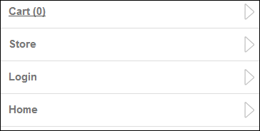
 If you are
using the Personify’s APA skin package, the bottom navigation is included,
as shown below, and you only need to update the URLs for your Login and
Online Store Landing pages. If you are NOT using the APA skin package
or you want to create new skin pages, you need to add specific HTML markup
tags to your page in order for the bottom navigation to display. Please
refer to Displaying Bottom Navigation Links on Responsive Pages for more
information.
If you are
using the Personify’s APA skin package, the bottom navigation is included,
as shown below, and you only need to update the URLs for your Login and
Online Store Landing pages. If you are NOT using the APA skin package
or you want to create new skin pages, you need to add specific HTML markup
tags to your page in order for the bottom navigation to display. Please
refer to Displaying Bottom Navigation Links on Responsive Pages for more
information.
b. Replace the word URL-PLACEHOLDER with your store's URL, as highlighted above.
c. Click Save.
For non DNN users, the web controls need to be placed and setup in a similar layout as the DNN layout with a center column to obtain the same results. In order for the whole user experience to be responsive, the website layout must be responsive. The header and footer are not part of the web controls; rather, they belong to the website layout.
To configure responsive CSS for the Login page:
1. Add the appropriate CSS classes to the following layout markup: header, other containers, and bottom mobile navigation. Refer to the CSS Guidelines for Responsive Design for additional information.
2. If you are using the
Personify’s APA skin package, the bottom navigation is included, as shown
below, and you only need to update the URLs for your Login and Online
Store Landing pages. If you are NOT using the APA skin package or you
want to create new skin pages, you need to add specific HTML markup tags
to your page in order for the bottom navigation to display. Please refer
to Displaying Bottom Navigation Links on Responsive Pages for more information.