As of 7.5.1FP1, the Full Product
Listing control can be configured to be responsive to mobile users.
The page must have a two column skin applied to it. Although the Online
Store Landing page and the Product Listing page both use a two column
skin, the CSS actions applied to the panes for each layout are different.
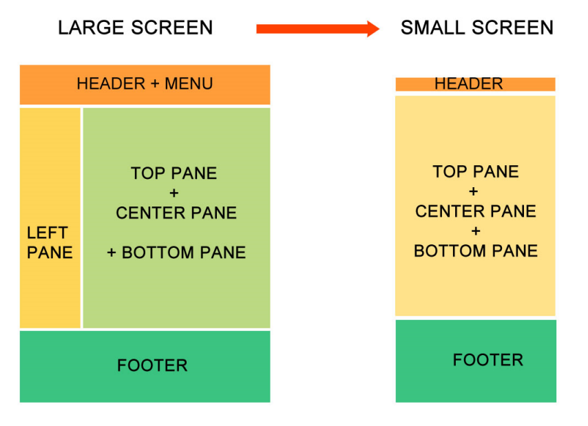
On the Product Listing page, the left column is suppressed on the mobile
device and the center column becomes the main page, as shown in the diagram
below. The controls that you want to be displayed on the mobile device
should be placed in the center column, since the left column is suppressed
on the mobile device.
As a best practice, the only control that should be dropped in the right
column is the Full Product Listing
control, because this control was designed to be responsive
and will render properly on a mobile device, as shown in the diagram below.
In addition, in the control settings for the Full Product Listing control,
the Store URL parameter needs
to be set to the Store Landing page's URL in order for the Store link
to render properly on mobile devices. You should not add any additional
controls to this page, because any other control that was not made to
be responsive will not render properly on a mobile device. In addition,
as a best practice, this page should NOT have a Marketing
control dropped on it, because of the real estate it will take up
on a screen for a mobile device; however, since it was designed to be
responsive, it can be added to this page if you desire.
Finally, the text on the Product Listing page will wrap to fit the width of the device. As a best practice, use clear/concise product descriptions, rate code descriptions, etc., so that the text does not wrap and it displays cleanly to the user (e.g., 1 year vs. one year membership). See Configuring the Back Office Settings for the Product Listing Control for more information.
Depending on which Content Management System (CMS) you are using will determine how you are going to configure the page in order to make it responsive. The following sections explain how to make your page responsive depending on which CMS you are using:
· DNN
 If
you add a promotional
control to the bottom of this page, you must enter "mobile-hide"
in the Additional CSS Class for Control
field for the promotional control. If not, the bottom navigation will
not work for the mobile version of this page.
If
you add a promotional
control to the bottom of this page, you must enter "mobile-hide"
in the Additional CSS Class for Control
field for the promotional control. If not, the bottom navigation will
not work for the mobile version of this page.
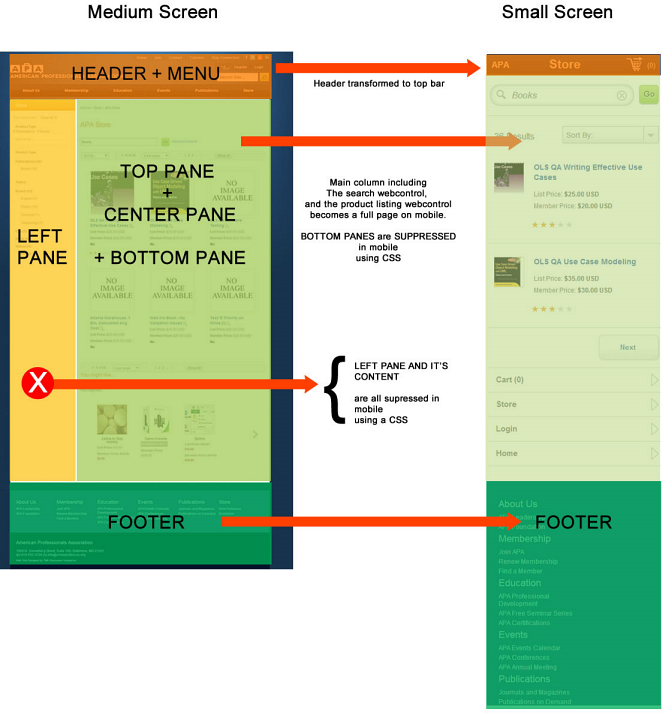
As of 7.5.1 FP1 in order for the Product Listing page to render properly on mobile devices, the Host: PersonifySkin-product-listing-responsive skin should be applied to it. This is a two column responsive skin where the left column is smaller than the right column. The controls that are dropped in the left column of the page are suppressed to mobile viewers; only the controls dropped on the right column will display to mobile viewers.
To configure responsive CSS for the Product Listing page:
1. Add the appropriate CSS classes to the following layout markup: header, other containers, and bottom mobile navigation. Refer to the CSS Guidelines for Responsive Design for additional information.
2. Log into your site as an administrator.
3. From the Admin menu,
select Page Management, as highlighted
below.
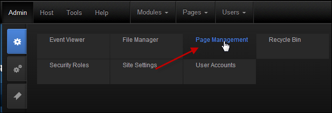
The Page Management screen displays.
4. Navigate to the
Product Listing page, right-click on it,
and select View Page, as highlighted below.
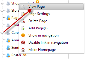
The Product Listing page displays.
5. From the toolbar, select
Edit Page > Page Settings, as highlighted
below.
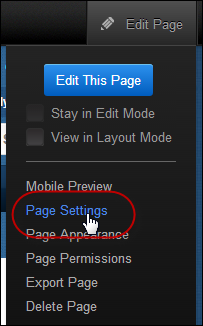
The Page Details screen displays.
6. Select the Advanced Settings tab.
a. From the Page Skin drop-down, select "Host: PersonifySkin - product-listing-responsive".
b. In the
Appearance section, enter the following meta link in the Page
Header Tags field:
<meta name= "viewport" content="initial-scale=1">
 This meta
link is what scales the page to fit the width of the phone or tablet.
If you do NOT add this meta link, it will display the desktop version
of the site on the mobile devices. If you create a new page and want it
to be responsive, you MUST add this meta link to the page and apply the
responsive skin.
This meta
link is what scales the page to fit the width of the phone or tablet.
If you do NOT add this meta link, it will display the desktop version
of the site on the mobile devices. If you create a new page and want it
to be responsive, you MUST add this meta link to the page and apply the
responsive skin.
c. Click Update Page.
7. Next, you will have to update your configurations for the Full Product Listing control.
a. From the
pencil icon, select Edit Web Control Container.
The Control Settings for the Full Product Listing control display, as shown
below.
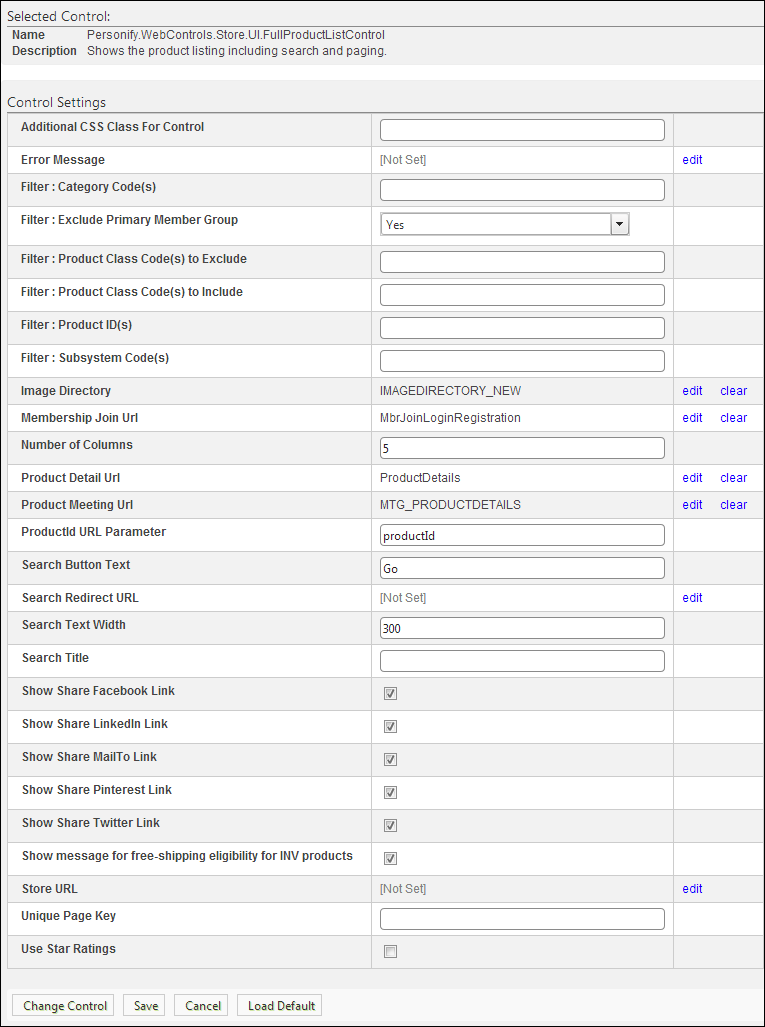
b. From the
Store URL line, click edit.
The Select/Edit Personify Web Parameter screen displays.
i. Click
the select link next to the appropriate PWF
parameter.
You should set the PWF parameter to a value (e.g., Store Landing page)
that will redirect users the Store page's URL when they click the Store
link located on the top and bottom of the page, as highlighted below.
See Setting Up PWF Parameters
to learn more about these parameters and why your website's redirect URLs
are managed there.
c. Click Save.
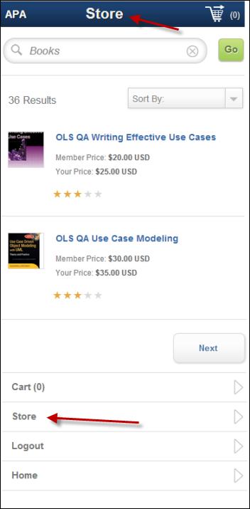
8. If you
are using the Personify’s APA skin package, the bottom navigation is included,
as shown below, and you only need to update the URLs for your Login and
Online Store Landing pages. If you are NOT using the APA skin package
or you want to create new skin pages, you need to add specific HTML markup
tags to your page in order for the bottom navigation to display. Please
refer to Displaying Bottom Navigation Links on Responsive Pages for more
information.
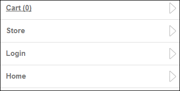
If you add
a promotional control
to the bottom of this page, you must enter "mobile-hide" in
the Additional CSS Class for Control
field for the promotional control. If not, the bottom navigation, as shown
above, will not work for the mobile version of this page.
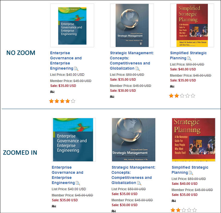
9. If necessary,
resize your images, so that they zoom in when being viewed on the responsive
site, as shown below. As a best practice, you should only resize your
product images if you do not have images with text or content that can
be compromised by the cropping/zooming.
a. Navigate to your network folder that holds your e-Business website files.
b. Select the Themes folder > PersonifyDefault folder > Store.PersonifyDefault.CSS.
c. Right-click
on the Store.PersonifyDefault.CSS file
and select Open with > Notepad, as shown below.
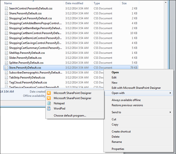
The Store.PersonifyDefault.CSS file opens.
d. Navigate
to the following code:
This is how the code should look when it does NOT resize your images.
/*START CODE*/
.ProductItemDisplayImage {
width:160px;
position:relative;
z-index:1;
display : block;
/*IF YOU WANT TO ZOOM THE PRODUCT
LISTING IMAGES
UNCOMMENT THE CODE BELOW and COMMENT
THE CODE ABOVE
*/
/* width:142%;
position:absolute;
top:-25%;
left:-23%;
z-index:1;
display : block;*/
}
/*END CODE*/
e. Add a */ to the beginning of the width:160px; line.
f. Add a */ to the end of the display : block; line.
g. From the */ width:142%; line, remove the */.
h. From the
display : block; */
line, remove the */.
This is how the code should look when it resizes your images.
/*START CODE*/
*/.ProductItemDisplayImage {
/*width:160px;
position:relative;
z-index:1;
display : block;/*
/*IF YOU WANT TO ZOOM THE PRODUCT
LISTING IMAGES
UNCOMMENT THE CODE BELOW and COMMENT
THE CODE ABOVE
*/
width:142%;
position:absolute;
top:-25%;
left:-23%;
z-index:1;
display : block;
}
/*END CODE*/
i. Click Save.
For non DNN users, the web controls need to be placed and set up in a layout that is similar to the DNN layout with a left column and a center column in order to obtain the same results. The left column is suppressed on the mobile device and the center column is what becomes the main page. In order for the whole user experience to be responsive, the website layout must be responsive. The header and footer are not part of the web controls; rather, they belong to the website layout. In addition, make sure that you place the Navigation Bar control in the left column and the Full Product Listing control in the right column.
To configure responsive CSS for the Product Listing page:
1. Add the appropriate CSS classes to the following layout markup: header, other containers, and bottom mobile navigation. Refer to the CSS Guidelines for Responsive Design for additional information.
2. If you are using the
Personify’s APA skin package, the bottom navigation is included, as shown
below, and you only need to update the URLs for your Login and Online
Store Landing pages. If you are NOT using the APA skin package or you
want to create new skin pages, you need to add specific HTML markup tags
to your page in order for the bottom navigation to display. Please refer
to Displaying Bottom Navigation Links on Responsive Pages for more information.
If you add
a promotional control
to the bottom of this page, you must enter "mobile-hide" in
the Additional CSS Class for Control
field for the promotional control. If not, the bottom navigation, as shown
above, will not work for the mobile version of this page.
3. If necessary, resize
your images, so that they zoom in when being viewed on the responsive
site, as shown below. As a best practice, you should only resize your
product images if you do not have images with text or content that can
be compromised by the cropping/zooming.
a. Navigate to your network folder that holds your e-Business website files.
b. Select the Themes folder > PersonifyDefault folder > Store.PersonifyDefault.CSS.
c. Right-click
on the Store.PersonifyDefault.CSS file
and select Open with > Notepad, as shown below.
The Store.PersonifyDefault.CSS file opens.
d. Navigate
to the following code:
This is how the code should look when it does NOT resize your images.
/*START CODE*/
.ProductItemDisplayImage {
width:160px;
position:relative;
z-index:1;
display : block;
/*IF YOU WANT TO ZOOM THE PRODUCT
LISTING IMAGES
UNCOMMENT THE CODE BELOW and COMMENT
THE CODE ABOVE
*/
/* width:142%;
position:absolute;
top:-25%;
left:-23%;
z-index:1;
display : block;*/
}
/*END CODE*/
e. Add a */ to the beginning of the width:160px; line.
f. Add a */ to the end of the display : block; line.
g. From the */ width:142%; line, remove the */.
h. From the
display : block; */
line, remove the */.
This is how the code should look when it resizes your images.
/*START CODE*/
*/.ProductItemDisplayImage {
/*width:160px;
position:relative;
z-index:1;
display : block;/*
/*IF YOU WANT TO ZOOM THE PRODUCT
LISTING IMAGES
UNCOMMENT THE CODE BELOW and COMMENT
THE CODE ABOVE
*/
width:142%;
position:absolute;
top:-25%;
left:-23%;
z-index:1;
display : block;
}
/*END CODE*/
i. Click Save.