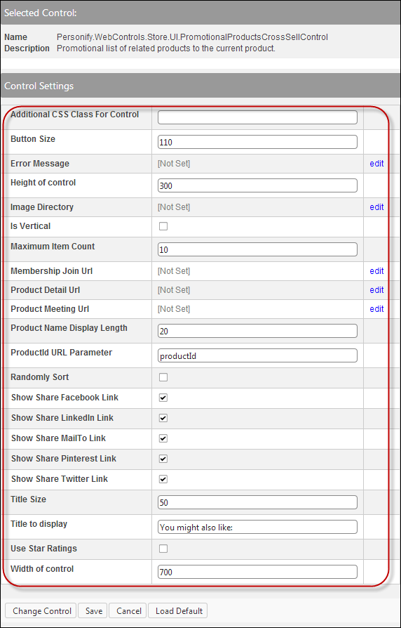
The following Control Settings display for this control, as shown below.
The instructions are intended for a web user with web admin/host privileges. In addition, this is a standalone control, which means that it has its own individual value, does not require another control in order for it to function, as well as it is not part of a specific workflow on the web. For more information, refer to the Standalone Controls section.
To configure the web settings for the Promotional Products Cross-Sell control:
1. Add the "PromotionalProductsCrossSellControl" to
the desired page. For more information, please see Adding
a .NET Web Control to a Page.
The following Control Settings display for this control, as shown below.
2. If necessary, in the Additional CSS Class for Control field,
enter the CSS class.
This option allows you to add additional layout to the skin by developing
a new DOTNETNUKE style, which requires an advanced understanding of HTML
and CSS.
3. In the Button Size text box, enter the width (horizontal) or height (vertical) adjustment for the space taken up by the buttons.
4. If necessary, select
or create a new Error Message.
The error message will display on the control for the action that was being
performed at the time of the error.
a. If left blank, the default error message, "An error occurred while performing [Insert Action]. If the problem persists, please contact the site administrator", will display. [Insert Action] will be substituted with the action the control was performing at the time of the error.
b. If you wish to change the default error message, customize it with a PWF parameter. See Setting up PWF Parameters for more information.
5. In the Height of control text box, enter the desired height of the control. If left blank, it will default to the recommended 250 for horizontal and 500 for vertical.
6. From the Image
Directory line, click edit.
The Select/Edit Personify Web Parameter screen displays.
a. Click
the select link next to the appropriate PWF
parameter.
The default image is “not_available.gif", as shown below, and this
ensures that the image exists in the image directory. If you would like
to change this default image, replace the not_available.gif file in
the image folder with the default image file of your choice.

7. If you want the control to display vertically, check the Is Vertical checkbox. If you want the control to display horizontally, uncheck this checkbox.
8. In the Maximum Item Count text box, the maximum items to return between 1-25.
9. From the Membership Join Url field,
click edit.
The Select/Edit Personify Web Parameter screen displays.
a. Click
the select link next
to the appropriate PWF parameter.
You should set the PWF parameter to a value (e.g., MemberJoinListing) that
will take the user to the Membership Join page's URL when he/she clicks
a membership product. If left blank, this field defaults to the Product
Detail page's URL. See Setting
up PWF Parameters for more information.
10. From the Product
Detail Url line, click edit.
The Select/Edit Personify Web Parameter screen displays.
a. Click
the select link next to the appropriate PWF
parameter.
You should set the PWF parameter to a value (e.g., PRODUCTDETAILS) that
will direct the user to the product details page.
b. If this PWF Parameter does not exist or you would like to create a new one, see Setting up PWF Parameters for more information.
11. From the Product
Meeting Url line, click edit.
The Select/Edit Personify Web Parameters screen displays.
a. Click
select link next to the appropriate PWF parameter.
You should set the PWF parameter to a value that will take the user to
the URL that will display all meeting products.
If this PWF parameter does not exist or you would like to create a new
one, see Setting up PWF Parameters for
more information.
 If left blank,
this parameter will default to the Product Detail Url.
If left blank,
this parameter will default to the Product Detail Url.
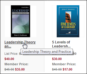
12. In the Product
Name Display Length text box, enter the number of characters you
want to display for the product name.
This field defaults to 20. If the product name exceeds the number of characters,
an ellipses will appear after the defined number of characters. A user
can hover his/her mouse over the product name to display all characters,
as displayed below.
13. In the ProductID
URL Parameter text box, enter "productid".
This is the default name of the parameter to read the product’s ID, but
if the environment's redirection logic uses a different Query String name
set it here. See Setting
up PWF Parameters for more information.
14. Check the Randomly
Sort checkbox.
Select this checkbox if you would like to randomly sort the items.
If you choose
this option, it will override your “Sort by” settings.
15. Check the Show
Share Facebook Link checkbox to show the Facebook icon on the Preview window.
Users can click on this icon and share the selected product with their
Facebook friends. When the user clicks this icon, he or she will be required
to log in to Facebook with his/her credentials.
16. Check the Show
Share LinkedIn Link checkbox to show the LinkedIn icon on the Preview window.
Users can click this icon and share the selected product with their LinkedIn
connections. When the user clicks this icon, he/she will be required to
log in to LinkedIn with his/her credentials.
17. Check the Show
Share MailTo Link checkbox to show the envelope icon on the
Preview window.
Users can click on this icon and mail the selected product to whomever
they want. This will open a blank email in the user’s default email system.
18. Check the Show
Share Pinterest Link checkbox to show the Pinterest icon on
the Preview window.
Users can click on this icon to pin the selected product to one of their
Pinterest boards. When the user clicks this icon, he/she will be required
to log in to Pinterest with his/her credentials.
19. Check the Show
Share Twitter Link checkbox to show the Twitter icon on the
Preview window.
Users can click on this icon and Tweet the selected product and share it
with their Twitter followers. When the user clicks this icon, he/she will
be required to log in to Twitter with his/her credentials.
20. In the Title Size text box, enter the desired title size. If left blank, it will default to the recommended 50.
21. In the Title to display text box, enter the title that will show up on the control. For example, “You might also like”.
22. Check the Use Star Ratings checkbox to display the user rating for products.
23. In the Width of control text box, enter the desired width of the control. If left blank, it will default to the recommended 700 for horizontal and 200 for vertical.
24. Click Save.