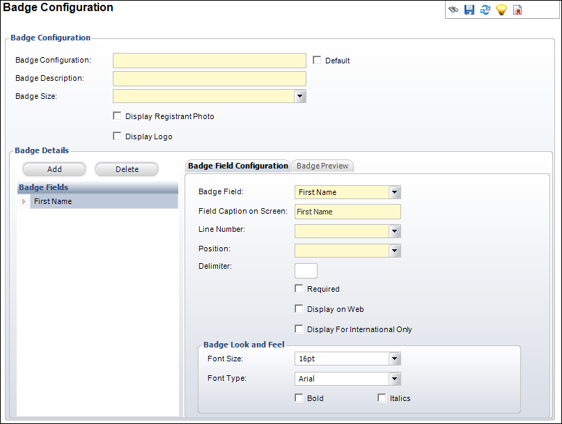
The Badge Configuration screen appears, as displayed below.
Before creating a meeting, you must define a default badge configuration. The badge configuration will be automatically assigned to meetings, unless otherwise specified during meeting product setup. From this screen, you can define the information that will appear on a badge, as well as its placement. You can access the Badge Configuration screen from either the Meeting Manager or the System Administrator personas.
To define a default badge configuration:
1. From the
Personify360 main toolbar, select Meeting Definition
> Badge Configuration.
A badge search screen displays.
2. Click Create
New.
The Badge Configuration screen appears, as displayed below.
3. Enter a title in the Badge Configuration field.
4. Enter a description of the badge configuration in the Badge Description field.
5. Select a Badge Size from the drop-down.
6. Check the Default checkbox if you want this record to be the default badge configuration option.
7. Check the Display Registration Photo checkbox, if necessary.
8. Check the Display Logo checkbox, if necessary.
9. Click Add.
A line is added to the Badge Fields table.
10. Select a Badge Field from the drop-down.
11. Enter a user friendly Field Caption on Screen, if necessary.
12. Select the line you want the field to display on from the Line Number drop-down.
13. Select the Position you want the field to display.
14. Enter a Delimiter to add between fields on the same line, if necessary.
15. Check the Required
checkbox if you want a user to enter information in this field before
proceeding.
The Display on Web checkbox is checked automatically.
16. Check the Display for International Only checkbox if you want this field to display only for countries that are not the United States.
17. Select a Font Size from the drop-down, if you want to change from the default 16pt.
18. Select a Font Type from the drop-down, if you want to change from the default Ariel.
19. Select the Bold checkbox if you want the field to display in bold font.
20. Select the Italics checkbox if you want the field to be italicized.
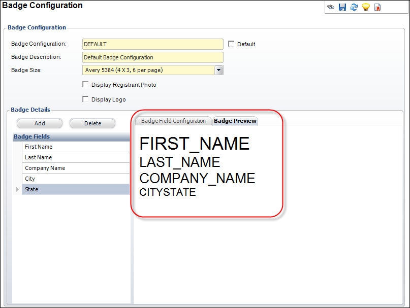
21. Click the Badge
Preview tab if you want to view a sample badge, as highlighted
below.
22. Click Save.
Screen Element |
Description |
|---|---|
Badge Configuration |
|
Badge Configuration |
Text box. A code for the badge. This can be a maximum of 24 alpha-numeric characters. |
Badge Description |
Text box. A user-friendly description of the badge. Maximum of 50 characters. |
Badge Size |
Drop-down. The badge size. There are three sizes supported in base: Avery 5384 (4x3, 6 per page), Avery 5390 (3.5x2.25, 8 per page), and Avery 8371 (3.5x2, 10 per page). Values in the drop-down are populated based on the fixed codes defined for the MTG "BADGE_SIZE" system type. |
Default |
Checkbox. When checked, the system will automatically assign this badge configuration to any new meeting product. A user will be able to select an alternative badge, if necessary. |
Display Registrant Photo |
Checkbox. When checked, a registrant's photo will appear on the top left corner of the badge, if defined and web enabled. |
Display Logo |
Checkbox. When checked, an image associated with the meeting or session product will display on the bottom left corner of the badge, if defined and web enabled.
|
Badge Details |
|
Add |
Button. When clicked, a new row is added to the Badge Fields table and the fields to the right will become active for a user to edit. |
Delete |
Button. When clicked, the selected badge details will be removed from the Badge Fields table. |
Badge Field |
Drop-down. A field to display on the badge. Values in the drop-down are populated based on the fixed codes defined for the MTG "BADGE_FIELD" system type. |
Field Caption on Screen |
Text box. Defaults to the selected Badge Field. If necessary, enter a user friendly name for the field, if necessary. |
Line Number |
Drop-down. A line number to specify the line the field will appear on. Values in the drop-down are populated based on the fixed codes defined for the MTG "LINE_NUMBER" system type. |
Position |
Drop-down. A position to determine the order a badge field will display on a line. Values in the drop-down are populated based on the fixed codes defined for the MTG "POSITION" system type. |
Delimiter |
Text box. A delimiter for the space between fields on a line, e.g. you may choose to enter a space or a comma. |
Required |
Checkbox. When checked, users will be required to enter information in this field. |
Display on Web |
Checkbox. When checked, badge information will display on the web. |
Display For International Only |
Checkbox. When checked, the badge field will display only if the country on the badge is not the United States. |
Font Size |
Drop-down. The size of the badge field. Values in the drop-down are populated based on the fixed codes defined for the MTG "FONT_SIZE" system type. |
Font Type |
Drop-down. The font style of the badge field. Values in the drop-down are populated based on the fixed codes defined for the MTG "FONT_TYPE" system type. |
Bold |
Checkbox. When checked, the badge field will display as bold text. |
Italics |
Checkbox. When checked, the badge field will display as italicized text. |
See Also:
· Defining Meetings Application Parameters
· Defining Organization Unit Meeting Parameters
· Setting Up Facilities for Meetings
 To have the meeting image printed
on registrant badges, define a default online store listing image
for the meeting. For more information, please see
To have the meeting image printed
on registrant badges, define a default online store listing image
for the meeting. For more information, please see