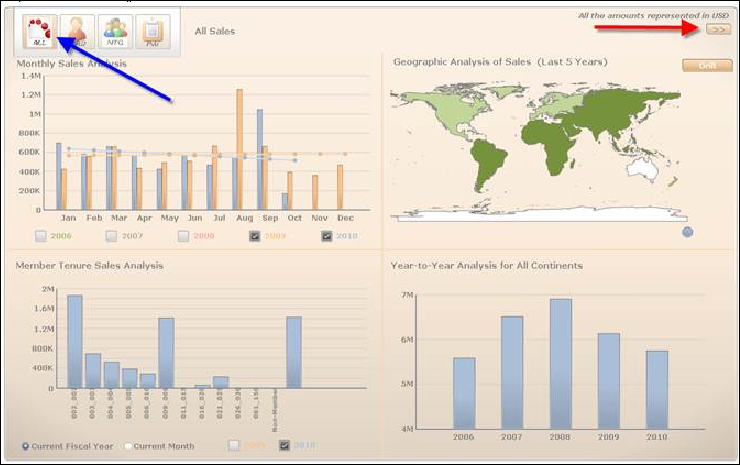
The Revenue Advantage Dashboard is divided into two pages with four quadrants each. The first page displays Monthly Sales Analysis, Member Tenure Sales Analysis, Geographic Analysis of Sales (Last 5 Years), and Year to Year Geographic Analysis for All Continents. The second page, More Analytics, displays Year-over-Year Customer Class Analysis (Top 5), Affinity Analysis (Top 5 Product Pairs), Reports, and Top 10 Customers.
![]() Click
to view More Analytics.
Click
to view More Analytics.
![]() Click
on an icon in the Sliding Picture Menu to display data for that particular
subsystem. The name of the subsystem is displayed to the right of the
menu.
Click
on an icon in the Sliding Picture Menu to display data for that particular
subsystem. The name of the subsystem is displayed to the right of the
menu.
By default, the Monthly Sales Analysis bar graph displays monthly sales data for the current and previous year for all subsystems. Click a different subsystem or check a different year(s) checkbox to change the displayed data. Hover over a bar in the graph to display the year, month, and total sales amount.
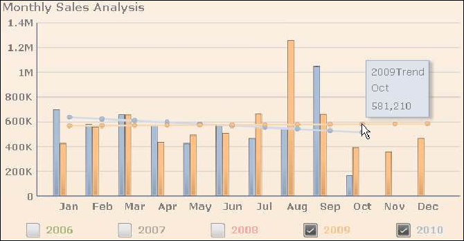
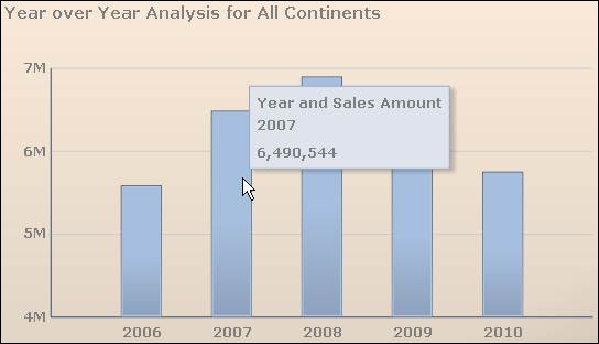
The horizontal line running across the bar graph represents the trend. Hover over a dot on the line to display the year, month, and total trend sales amount.
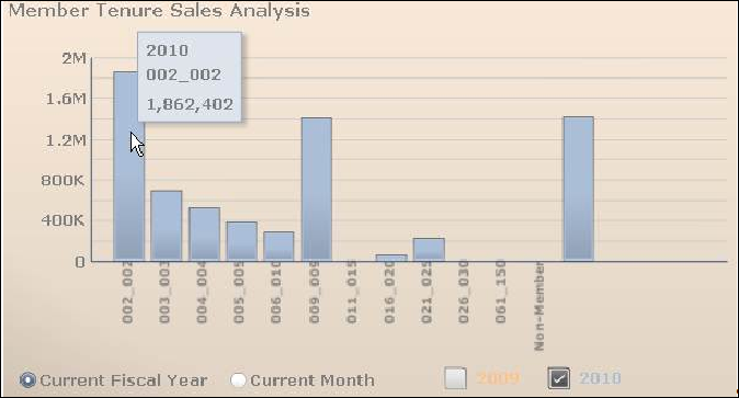
By default, the Member Tenure Sales Analysis bar graph displays member tenure sales data for the fiscal current year for all subsystems. Select a different subsystem, select the Current Month radio button, or check the previous year checkbox to change the displayed data. Hover over a bar in the graph to display the year (or month), member tenure, and total sales amount. The member tenure is configurable through app type codes.
& ;
;
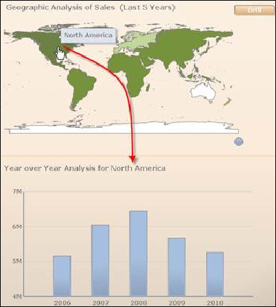
The Geographic Analysis section displays a color-coded map of the world. The color of the continent is dependent on the average of the past five years. Point to the circle icon to display the Legend.
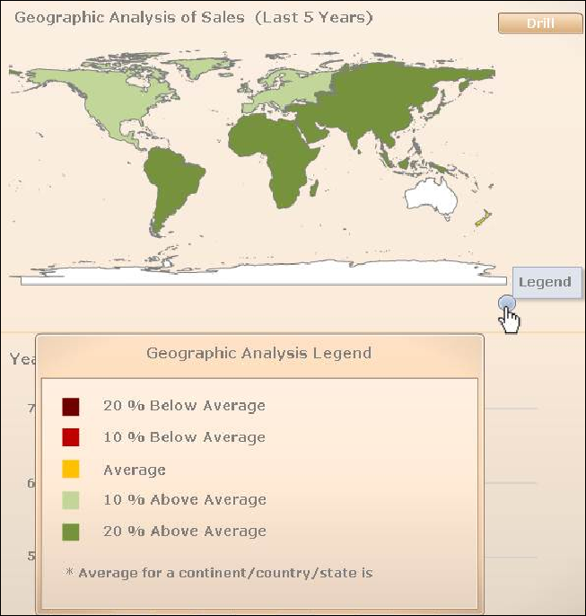
Click a continent to display data for the continent in the Year over Year Analysis bar graph below. ClickDrill to further drill down to view totals by states. ClickDrill Up to return to the previous map view.
By default, the Year to Year Geographic Analysis displays fives year of sales data for all continents. Hover over a bar in the graph to display the total sales amount for the year.
Click on a continent in the Geographic Analysis of Sales map above to display specific data for that continent.
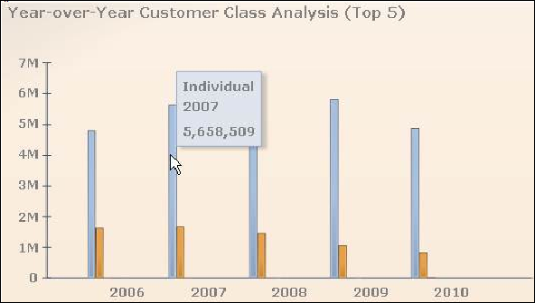
The Year-over-Year Customer Class Analysis (Top 5) bar graph displays five years of sales data for all subsystems. Depending on the subsystem selected, data will be displayed for customer class. Each different colored bar graph represents a different customer class. Click a different subsystem to change the displayed data. Hover over a bar in the graph to display the customer class, year, and total sales amount.
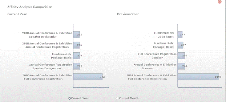
By default, the Affinity Analysis bar graph displays the top five total annual count of product pairings for the current year. The number in the bar on the graph represents the quantity. Select the Current Month radio button to change the displayed data.

ClickCompare To Previous to display the comparison between the current and previous year (or month).
The Reports section displays the default reports. Click on the report link to view the entire report. For more information on each report, see the “Revenue Data Warehouse Reports” section.
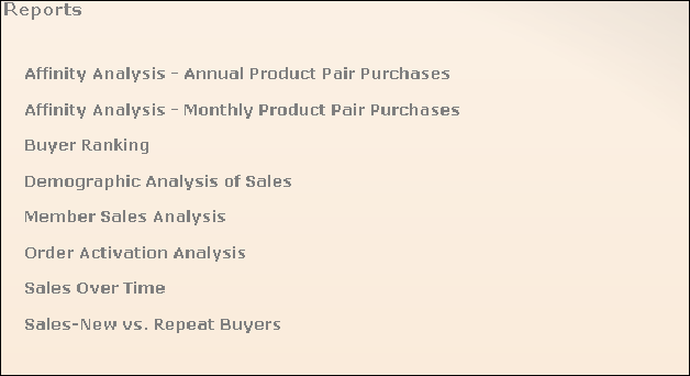
You can add additional reports as desired. See “Configuring Favorite Reports” for more information.
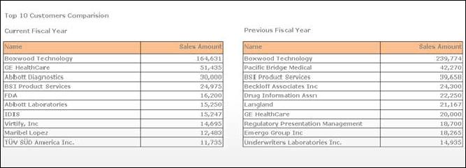
The Top 10 Customers section displays a table listing the top ten customers and the sales amount for the current fiscal year (or month). Select the Current Month radio button to change the displayed data.
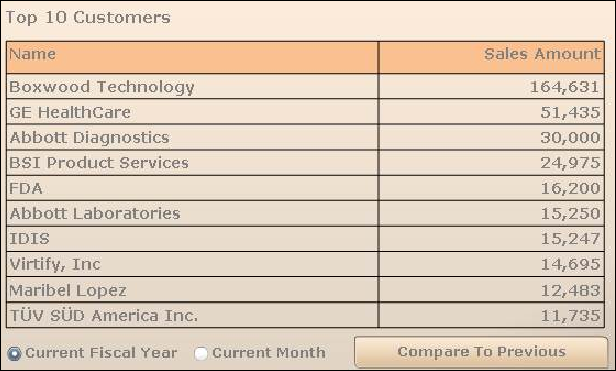
Click Compare To Previous to display the comparison between the current and previous fiscal year (or month).
See Also:
· Overview: Revenue Advantage Data Mart
· Answering User Questions about Revenue Analytics
· Configuring Revenue Advantage Favorite Reports