 Your
organization may use the following website to convert the RGB color into
the corresponding integer representation necessary for the Personify360
Mobile: http://www.shodor.org/stella2java/rgbint.html.
Your
organization may use the following website to convert the RGB color into
the corresponding integer representation necessary for the Personify360
Mobile: http://www.shodor.org/stella2java/rgbint.html.Your organization has the option to brand the Personify360 Mobile app. The following screenshots and corresponding tables will be used as a guide to rebrand the app with a specified colors and themes. After all requirements are determined, the configuration details are mapped to the app.css file in App47 so that Personify360 Mobile is tailored to your specifications.
Your
organization may use the following website to convert the RGB color into
the corresponding integer representation necessary for the Personify360
Mobile: http://www.shodor.org/stella2java/rgbint.html.
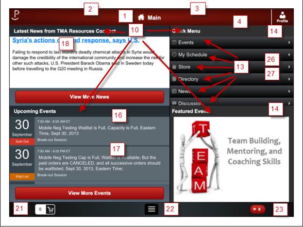
The following tables list the styling options for the tablet and phone devices, as well as the base settings for each. You may change these options to fit the need of your organization.
Item |
Description and Identifier |
Base Settings |
|---|---|---|
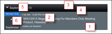
aroundcolor |
1 – The gradient color that displays around the header |
#82160C |
centercolor |
2 – The color that displays in the middle of the header. |
#3D0804 |
bordertopcolor |
3 – The border that displays on top of the header |
#662725 |
borderbottomcolor |
4 – The border that displays at the bottom of the header. |
#661006 |
titlefontfamily |
Font |
Ariel |
titlefontsize |
Size |
16pt |
Titlefontcolor |
Color |
white |
The following colors are not listed separately in the image above, but can be used to change the display of the home page title (“Main” in the image above).
Name |
Description and Identifier |
Base Settings |
|---|---|---|
Fontfamily |
Main title font |
Inherit |
Fontsize |
Main title size |
18pt |
fontcolor |
Main title color |
white |
Name |
Description and Identifier |
Base Settings |
|---|---|---|
panelright-color |
14 – The background color that displays in the section header (e.g. Quick Menu background). |
Gray |
panelleft-colorstart: |
The starting gradient color background behind menu options (i.e. if no upcoming events are displayed, this color will display in the quadrant). |
|
panelleft-colormiddle: |
16 – The middle gradient color background behind menu options (i.e. if no upcoming events are displayed, this color will display in the quadrant). |
|
panelleft-colorend |
17 - The ending gradient color background behind menu options (i.e. if no upcoming events are displayed, this color will display in the quadrant). |
|
Name |
Description and Identifier |
Base Settings |
|---|---|---|
newsheadertitle-color |
18 – The color of the news article title that displays in the Latest News section. |
#00396d |
newsheadertitle-fontsize |
Size |
22px |
newsheadertitle-fontfamily |
Font |
inherit |
Name |
Description and Identifier |
Base Settings |
|---|---|---|
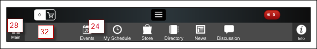
menubarPanelTop-colorstart |
21 - The starting gradient color in the footer background. |
#0e0e0e |
menubarPanelTop-colormiddle |
22 - The middle gradient color in the footer background. |
#2b353a |
menubarPanelTop-colorend |
23 - The ending gradient color in the footer background. |
#0e0e0e |
Presseditembackgroundcolor |
24 - The color a menu item turns when selected. |
#cf3424 |
Presseditemtextcolor |
24 - The text color that displays when an item is selected. |
#ffffff |
Name |
Description and Identifier |
Base Settings |
|---|---|---|
menulist-colorstart |
26 – The quick menu item color gradient. |
#45484d |
menulist-colorend |
27 – The quick menu item color gradient. |
#000000 |
headerinfoandhomebtn |
28 – The color displaying behind the Home and Info button on the footer menu. |
#303030 |
Headerinfoandhomebtntextcolor |
29 - The test color displaying on the Home and Info button on the footer menu. |
#000000 |
headerMainBtnSelected |
30 – The color the Main button turns when selected. |
#303030 |
headerMainBtnSelectedtextcolor |
31 – The color the Main button text turns when selected. |
#000000 |
menubarpanel-background |
32 – The color of the footer menu bar. |
#4A4A4A |
Name |
Description and Identifier |
Base Settings |
|---|---|---|
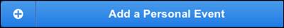
bluebuttonborder |
The color of the border of the personal event button. |
#20497B |
bluebuttonshadow |
The color of the shadow that displays with the Personal Event button. |
#3F3F3F |
bluebuttonbackgroud-colorstart |
The starting gradient color in the background of the button. |
#499bea |
bluebuttonbackgroud-colorend |
The ending gradient color in the background of the button. |
#207ce5 |
bluebuttonbackgroud-pressed-colorstart |
The starting gradient color when the button is selected. |
#4587d8 |
bluebuttonbackgroud-pressed-colorend: |
The ending gradient color when the button is selected. |
#165ba0 |
Name |
Description and Identifier |
Base Settings |
|---|---|---|
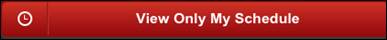
redbuttonborder |
The color of the border of the View Only My Schedule button. |
#930B0B |
redbuttonshadow |
The color of the shadow that displays with the View Only My Schedule button. |
#3F3F3F |
redbuttonbackgroud-colorstart |
The starting gradient color in the background of the button. |
#cf3424 |
redbuttonbackgroud-colormiddle: |
The middle gradient color in the background of the button. |
#6d0007 |
redbuttonbackgroud-colorend |
The end gradient color in the background of the button. |
#470001 |
redbuttonbackgroud-pressed-colorstart |
The starting gradient color when the button is selected. |
#930b0b |
lablebuttonredcolor |
The ending gradient color when the button is selected. |
#ffffff |
Name |
Description and Identifier |
Base Settings |
|---|---|---|
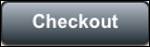
graybuttonborder |
The color of the border of the Checkout button. |
#303030 |
graybuttonshadow |
The color of the shadow that displays with the Checkout button. |
#3F3F3F |
graybuttonbackgroud-colorstart |
The starting gradient color in the background of the button. |
#b5bdc8 |
graybuttonbackgroud-colormiddle |
The middle gradient color in the background of the button. |
#828c95 |
graybuttonbackgroud-colorend |
The end gradient color in the background of the button. |
#28343b |
graybuttonbackgroud-pressed-colorstart: |
The starting gradient color when the button is selected. |
#9da4ad |
graybuttonbackgroud-pressed-colormiddle |
The middle gradient color when the button is selected. |
#646b72 |
graybuttonbackgroud-pressed-colorend |
The end gradient color when the button is selected. |
#1b2328 |
lablebuttongraycolor |
The color of the text in the button. |
#ffffff |

Name |
Description and Identifier |
Base Settings |
|---|---|---|
bluebloodbuttonborder |
The color of the border of the personal event button. |
#4773AA |
bluebloodbuttonshadow |
The color of the shadow that displays with the Personal Event button. |
#3F3F3F |
bluebloodbuttonbackgroud-colorstart: |
The starting gradient color in the background of the button. |
#588cc8 |
bluebloodbuttonbackgroud-colorend |
The ending gradient color in the background of the button. |
#3b7cc6 |
lablebuttonbluebloodcolor |
The color of the text in the button. |
#ffffff |

Name |
Description and Identifier |
Base Settings |
|---|---|---|
directorydeletecolor |
The color that displays in the delete button. |
red |
directorydeletecolor-pressed |
The color the delete button displays when pressed. |
#8E0200 |
directorydeletetextcolor |
The color the text displays. |
white |
Name |
Description and Identifier |
Base Settings |
|---|---|---|
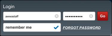
loginpanelbackground-colorstart: |
The starting gradient color in the background of the login screen. |
#364249 |
loginpanelbackground-colorend |
The ending gradient color in the background of the background of the login screen. |
#515f6b |
Name |
Description and Identifier |
Base Settings |
|---|---|---|
newstitlehomepage |
The color the title displays in the news quadrant. |
#0035F4 |
Name |
Description and Identifier |
Base Settings |
|---|---|---|
segmentedbutton-dblecolo |
1 – The color that displays for an inactive tab. |
gray |
segmentedbutton-activecolorstart |
2 – The starting gradient color that displays for an active tab. |
#499bea |
segmentedbutton-activecolorend |
3 - The ending gradient color that displays for an active tab. |
#207ce5 |
Name |
Description and Identifier |
Base Settings |
|---|---|---|
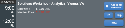
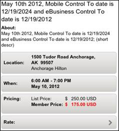
eventitembackground |
1 – The event list item background. |
#5D6A72 |
eventitemtextcolor |
2 – The color of the text in the event list item. |
white |
newheaderbackground-colorstart |
3 – The starting gradient color that displays for the event list item. |
#45484d |
newheaderbackground-colorend |
4 – The ending gradient color that displays for the event list item. |
#000000 |
Newheadertextcolor |
5 – The color of the month text in the event list. |
white |
dayInfoPanelbackground |
6 – The color of the event date in the list. |
#364249 |
Name |
Description and Identifier |
Base Settings |
|---|---|---|
panelgraygradient-colorstart |
The starting gradient color that displays in the event detail header. |
#9b9b9b |
panelgraygradient-colorend |
The ending gradient color that displays in the event detail header. |
#c9c9c9 |
buttondblebackground |
The button background color. |
gray |
toggleoption-colorstart |
The starting gradient color that displays behind the event detail time. |
#364249 |
toggleoption-colormiddle |
The middle gradient color that displays behind the event detail time. |
#45535e |
toggleoption-colorend |
The ending gradient time that displays behind the event detail time. |
#566575 |
toggleoption-labelcolor |
The color the text displays for the event detail time. |
white |
Name |
Description and Identifier |
Base Settings |
|---|---|---|
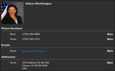
Profilepanelrighttextcolor |
The color of the text that displays on the profile. |
white |

Name |
Description and Identifier |
Base Settings |
|---|---|---|
buttonmenubarpressed |
The color the menu button displays when selected. |
#cf3424 |
buttonmenubarbackground |
The color of the menu button. |
black |
Name |
Description and Identifier |
Base Settings |
|---|---|---|
menuitemtextcolor |
The color the text displays on the menu. |
white |
Name |
Description and Identifier |
Base Settings |
|---|---|---|
conferentmenubackground-colorstart |
The starting gradient color that displays for the event details menu items. |
#ededed |
conferentmenubackground-colormiddle |
The middle gradient color that displays for the event details menu items. |
#e3e1de |
conferentmenubackground-colorend |
The end gradient color that displays for the event details menu items. |
#cecdca |
conferentmenub-textcolor |
The color of the text that displays in the event menu. |
Black |
conferentmenub-pressed-textcolor |
The color the text displays when a menu item is selected. |
White |
complexeventpanelbackground-colorstart |
The starting gradient color that displays in the background of the event details section. |
#848484 |
complexeventpanelbackground-colorend |
The ending gradient color that displays in the background of the event details section. |
#dadada |
Name |
Description and Identifier |
Base Settings |
|---|---|---|
toolbartitlecolor |
The color of the text that displays the screen name. |
white |